The Emphasis on a Beautiful Appearance
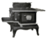
There is an importance when making purchases on the way that things look. Especially when not people are not shopping in person and rather through catalogues, there is a need to include as much of the missing direct visual experience as possible. The 1910s to 1930s are some of the first decades where catalogues like those from Eaton’s grew increasingly visual in marketing goods, particularly with things like stoves. They usually display their products with etched designs or some kind of photographic process that I have been unable to determine exactly. These kinds of images are only so clear and can only show so much, so where those images lack they add in the textual description.
The way that they describe the aesthetics of stoves ranges from the elegant to the practical. Referencing the materials or simply denoting the style, manufacturers can appeal to their audiences by giving the specific details that a customer can be looking for in a kitchen range. Substantial portions of these advertisements will be devoted to describing the look and finish of these appliances, especially for conveying things like colour that do not come across in black ink drawings. Not only does this appeal to a personal sense of taste and style, but also allows for the societal standards to keep up appearances even in domestic spaces. These draws to find specifically styled stoves is matched by advertisers who are describing their products in the most enticing way while giving a detailed enough description for the buyer to make a decision.