Molly Bang exercise
Bang's exercise (included on pages 128-132 of Picture This: How Pictures Work) provides an opportunity to put the principles outlined in the text to work, deepening students' understanding of how "the structure of a picture . . . affect[s] our emotional response" (xiv).
The paramaters of the exercise are quite simple: using only cut paper (white plus three other colours) and simple shapes, students were to create an image representing "Bird(s) or Shark(s) Attacking a Victim." Each student was to consider which specific elements in the situation evoked fear in them and then to find ways to highlight those elements in their image.
The idea was to see how simple shapes and colours and the locations of objects on the page could evoke fear in the viewer.
Students did a first version of their image in class. Afterwards, they took it home and analyzed it, considering what they could do to make their image even more frightening. Bang's instructions tell them to review their image "with the same specific questions in mind: Does my picture communicate 'attacking bird(s) or shark(s)'? Have I used the principles to evoke the feeling I want?" (130).
Having performed that review and analysis, the students revised their images until they felt they successfully evoked the response they were seeking.
The results of their efforts are below.
Student: Hailey Marchand
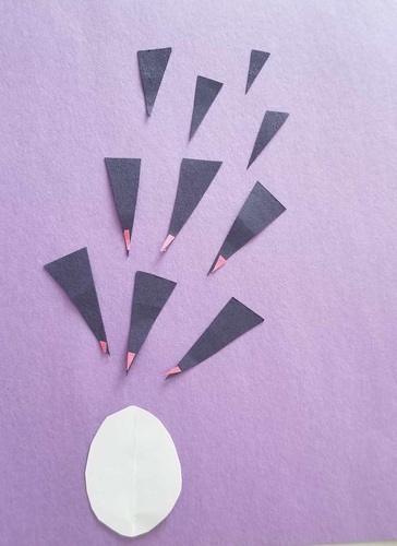
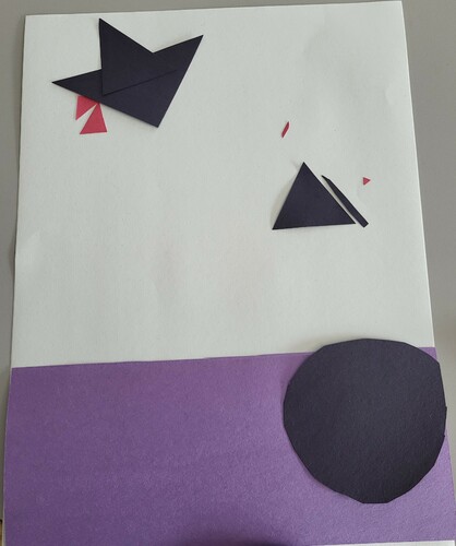
In the intial image, I’m trying to depict a bird attack. I decided to use black triangles for the birds because I wanted to capture what a bird looks like while diving using the simplest shapes I could. I added red beaks (unfinished) to make them look more bird-like and to highlight their threatening pointiness. I chose to depict a flock of birds attacking because that seemed scarier than a single large bird. I was attempting perspective by making the birds at the top of the page smaller.
The white shape is supposed to be the victim. I wanted to use a round shape that would seem vulnerable to the pointy beaks, as though it might pop. Right now, I think it looks too much like an egg, which makes the image confusing. Why would birds attack an egg?
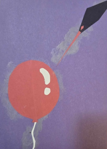
During the revision process, I focused mostly on the victim of the bird attack. In my initial draft, I had no idea who or what was being attacked. I had an inkling that the victim should be a round shape to contrast with the triangular birds and so it would seem vulnerable to their pointy beaks. I decided to lean into my idea that the victim should look like it might pop by making the bird attack a red balloon. As a toddler, I was scared of balloons because I knew they would make a very loud noise if they popped. In my final image, the source of fear isn’t really the bird itself, but the imminent popping noise. I doubt this image would seem threatening to adults, but it might have scared me when I was three!
Having an inanimate object as my victim presented some challenges. Molly Bang recommends leaving some distance between the attacker and the victim to heighten the tension, but there’s no real possibility for escape in my image. I decided the highest point of tension would be the moment right before the pop, which is why the bird’s beak is so close to touching the balloon. I also tried making the attacker much bigger than the victim, as Bang suggests. However, a large bird attacking a small balloon didn’t look scary at all. I realized it’s because we associate large objects with loud noises. The bigger the balloon, the bigger the bang when it pops.
I kept the basic idea of a black bird with a red beak, but I realized the “diving” shape I wanted was more of a diamond than a triangle. I experimented with giving the bird wings and making it shaped more like a missile but didn’t like the results. I wanted the shape to convey speed, and I have the bird coming in on an angle to emphasize movement. I found that the image looked more dynamic with the bird partially off the page. I opted to make the bird smaller than the balloon but extend its beak to look more like a needle.
Student: Ashley Tenn
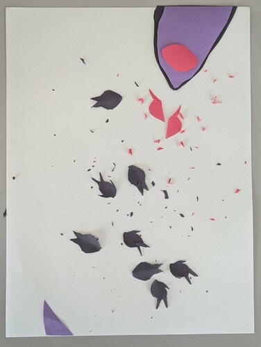
Initial version: The fish were cut without guides, but I missed the "no pencil" rule, so my shark had some help . . . . I added a fin at the bottom to tie the piece together–the fish, therefore, are surrounded, even if we see only the threatening mouth of one of them.
Final version: Wanting to continue with the idea of Many, I aimed to evoke teeth with the shark fins at the bottom of the page, surrounding the school of fish. The shark above has managed to eat some already, which is reflected by the red of its teeth and the red of its victims.
Student: Sabrina Beaton
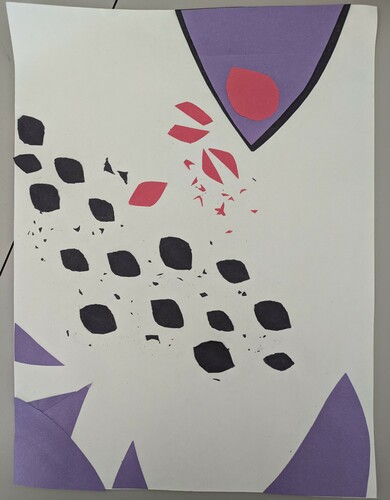
Initial version: The early stages of a bird (following the basic shapes Molly Bang used for Little Red Riding Hood). I wanted to give it red talons which would connect to what it is hunting or chasing – but that part has not formalized itself yet!
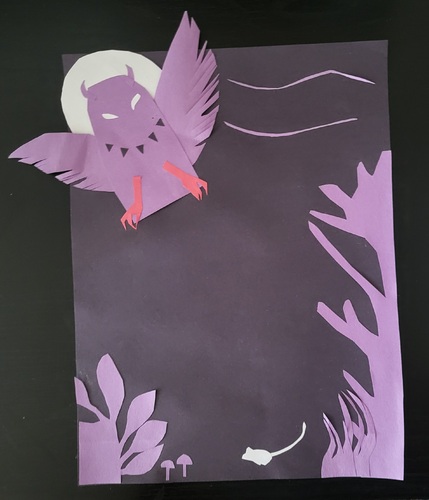
Final version: This owl breaks the frame to suggest both invasion and power. It also covers most of the moon and its eyes, white like the moon, suggest its ability to see at night and the white mouse’s inability to hide. The only red in the picture is the talons, to emphasize their threat. The trees and plants are round and indistinct to contrast with the owl’s sharpness and there is just enough space for the mouse to possibly be able to escape.
Student: Brooklyn Wilkins
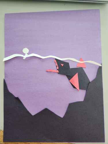
I had a very good idea of how I wanted this to turn out when I began. A purple, ominous background. Black depths to signify the terrifying vastness of the ocean. The sharks body being sharp and black to show that’s where it belongs, with red accents on its scariest features — eyes, teeth, and fins.
The person is white along with the waves to signify their perceived feeling of safety in the water, unknowing of the danger around them, with round soft shapes to aid that.
But it can be better.
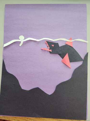
For the final version, I sharpened the depths, wanting to be consistent with the sharpness of the black on the page. It definitely helped heighten the intensity, but it was still missing something.
Then I remembered what Bang said in her book about diagonals and dynamic movement …
I tilted the waves at an angle, making it look like the person was being sucked down toward the shark, and tilted the shark and further opened its mouth so that it looked as if it was actively hunting the person swimming!
And with that, I have my simplified shark attack!
Reflection on the activity:
This activity was really really nice! As someone who does a lot of art and drawing, I found it a great reminder to be imperfect and to return to the basics. It allowed me to pause and consider how could some of my own characters be broken down into singular colours or shape? How do I percieve certain colours and shapes and what emotions do I feel from them? Overall a great mindfulness activity as well as fun art practice.
While I personally am not afraid of sharks (at least not as a concept), it was a good practice on putting myself in the reader’s/viewer’s perspective. I was lucky that my twin is afraid of sharks and the ocean, so I was able to use the main elements that I know terrify her: The way you never know if one is right there. That the ocean is so big and dark, you could be swimming with a shark and never know until it is too late. I hope my picture evokes that fear.

